Recently, I had the opportunity to create a design plan for Denise's dining room. She had a great start to a fabulous space. She called upon me to help her with the finishing touches. After getting to know about her lifestyle, design preferences and budget, we created a step by step design plan that included her current pieces as well as new elements.
Here is a look at the space before the design consultation...
We provided Denise with a design plan that included this inspiration board...
...a true to scale illustration of the space, a "where to buy" source list with specific product recommendations and step by step instructions on how to put the design in place...
Denise got to work right away implementing the plan.
Here is what the room looks like now...
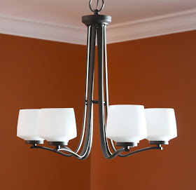
Her room already had great bones. A spicy orange wall color, picture frame molding, and a beautiful dining table. The elements we added to the space were a mix of contemporary and traditional in style to compliment her existing pieces and tie the space together. For example, she had a clean, sleek chandelier...
and a traditional style dining set.
Denise had a piece of art that she wanted to keep in the space (image below). It was a little small in scale, so to give it more of a presence, we recommended that she add a large black frame and flank it with a pair of sconces. Now it fills the wall space nicely.
I chose a colorful set of dishes from Pier One for her table.
The new place setting plays nicely with the fabric used for her custom window treatment.
One of the biggest improvements in this space was the addition of a patterned area rug. In Denise's design plan, we recommended a large area rug (the one she had in the space previously was a little too small). I chose a gorgeous spicy orange patterned wool area rug.

A common misconception is that a large rug will make a space feel smaller. In this example, it has the opposite effect, it expands the space making it feel larger.
To fill an empty area and to provide storage and an additional serving surface, we recommended a beautiful black buffet table with a fun, unique round mirror and a pair of lamps.
Again, here is a side by side comparison of the space before and after our design consultation…
{After}
{Before}
{After}
Thank you, Denise for letting me share these before and after pictures. You did a fantastic job implementing your design plan!
For more information on my online design plan service, click here.
© Copyright 2013 The Yellow Cape Cod


Beautiful!
ReplyDeleteThanks, Ruby!
DeleteBeautiful -- love the accents
ReplyDeleteThis is a great post - and shows your talent. I love seeing a "good" space become a "great" space. Thanks for sharing the photos!
ReplyDeleteThank you Liz!
DeleteI'm tired of constantly seeing blue and gray, so this rich orange is simply gorgeous. I would have been scared to use an orange rug, but it makes the room perfect!
ReplyDeleteThis palette is very warm. It was a really fun project. Thank you!
DeleteI'm tired of constantly seeing blue and gray, so this rich orange is simply gorgeous. I would have been scared to use an orange rug, but it makes the room perfect!
ReplyDeleteWhat an amazing space, and what an amazing end result. I only wish I had you here in NZ.
ReplyDeleteHi Caroline, thank you for your kind words! I can do this for you through my online design service! Here is a link for more info: http://www.theyellowcapecod.com/p/design-services_18.html I would love to work with you. Sarah
DeleteLove it! I hope more of your clients let you show their "before and after" photos!
ReplyDeleteThanks Sara. It is fun to see before and afters!
DeleteThis is a beautiful transformation with just a few simple pieces.
ReplyDeleteI'm wondering if you can tell me where the sconces are from?
Hi Mel, thanks!
DeleteThis is beautiful! Would your client be interested in sharing where she found the lamps - I love the ones you recommended in your design board, but the price tag of the Candice Olson version is a little high. The ones your client found are perfect!
ReplyDeleteCks, I would be happy to share because this was a great example of getting the "look for less".
DeletePier One :) Thanks! Sarah
Would your client be willing to share where the Pillar Candle Wall Sconces are from? They are gorgeous!
ReplyDeleteLove the rug.. can you please share from where I can get this rug?
ReplyDelete-Sh
Could you tell me what the name of the paint color is and where it is from?
ReplyDeleteCould you tell me what the paint color is and where it is from. So pretty and warm
ReplyDeleteHi Sara love the paint color on the wall. Would their be any way denise could share that. Love every room design you put together. You are Amazing!
ReplyDelete