For information on my affordable online design service, click here.
Today, we are going back in time a bit to revisit my recent kitchen makeover. Due to a recent pin-gone-viral, I've received many emails requesting sources of elements in the new space. Before I share, let's take a look at the project.
Here is what my kitchen looks like now...
After
After
After
After
Here's is what it looked like originally...
Before
Before
You may remember when I began the makeover. It started with a grand vision of the "perfect kitchen". The "perfect kitchen" design plan quickly exceeded our budget. Once I gave myself a reality check, I focused on making the space "better" instead of "perfect".
In the end, I am happy with the better kitchen. Most of the elements we used were budget friendly finds from everyday retailers. Here is the source list...
"Absolute Black" granite.
Glass Jars~Target
Wall Color, "Coir" by Martha Stewart. Coir has since been discontinued. Martha's "Heath" is very similar.
For a complete post dedicated to our cabinet makeover, click here.
Our cabinets were painted by a local professional cabinet painter and the moldings were added by a local carpenter. The cabinet paint color, "Tailors Chalk" by Martha Stewart.
Three light lantern, The Home Depot.
Wine Storage/Cook book baskets and labels, from Ballard Designs.
A real wine fridge was part of the "perfect kitchen" design plan.
This is the "better kitchen's" version. For the tutorial post on this project, click here.
Dining table and chairs, Crate and Barrel.
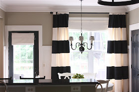
Chandelier, The Home Depot (with custom shades).
Bar stools, The Great Indoors.
Bar stool fabric, Hobby Lobby.
Rug, RugsUSA.com
Cabinet hardware, The Home Depot.
Super Thick Crown Molding Trick, details can be found here.
Interior Black Doors, can be read about here.
Drapes, DIYStriped Drapes Tutorial. (Or, email theyellowcapecod@yahoo.com for information on how to purchase fully lined, meticulously sewn version of these striped drapes).
Our kitchen makeover has made an appearance in this month's edition of Ladera Ranch Magazine.
Ladera Ranch is an Orange County lifestyle publication. I have had the incredible opportunity to contribute to this beautiful magazine during the past year.
If you would like to get started on a kitchen makeover, click here for information on my affordable online design service. I love a good kitchen project!
© Copyright 2013 The Yellow Cape Cod


Just lovely!!
ReplyDeleteLooks nice although fridge looks too big for the space
ReplyDeleteYour kitchen is gorgeous! Such a huge change painting your cabinets. Your cabinets look like mine, except my builder didn't give us the raised panel cabinet doors. Ours have the thin inset and sound tinny when they close. I am holding out for new cabinets. The laminate on the bottom doesn't even go to the edge of the cabinet facings. I am patiently waiting. I want something different than oak and would love to stagger the heights of them, with a corner cabinet (like where your wine storage is) and a lazy susan in the one below. Those corners are a pain to get things in and out of in mine.
ReplyDeleteStunning...looks simple, crisp & functional. I would love to cook & eat in that space.
ReplyDeleteI love this space! The wall color, counter tops, white cabinets...it looks elegant & sophisticated, but functional, too.
ReplyDeleteHi Sarah, everything about it looks perfect!!!!! Beautifully done as always!
ReplyDeleteHi Sarah, your kitchen turned out fabulous! so many people don't get "better" cause they're focused on "perfect". Your "better" looks pretty "perfect" to me!!
ReplyDeleteLove your re-do! Do you have any recommendations for how to find a local professional cabinet painter? We had our oak cabinets painted by a professional painting company but I'm not thrilled with the results. I'd love to find someone with more cabinet expertise. Thanks!
ReplyDeleteAmazing makeover!!! Love all the black and white!
ReplyDeleteLOVE IT!!! It looks amazing! Just one question. We have a very similar back door...where did you find your shade for that? Currently we just have a cheap bamboo shade. But I really like the idea of white. Thanks!
ReplyDeleteThis kitchen is beautiful! It is almost exactly what I am looking for in my kitchen reno-minus a few small details. This is very inspiring!!!
ReplyDeleteI love the simplicity and functionality! Beautiful!
ReplyDelete