Hey guys. I received some pretty fantastic news about the upcoming fall home tour (next week). I can't spill the beans yet, just know…it's gonna be good. The line up of bloggers participating is exciting enough, but in addition someone else is joining us on the tour. Someone big.
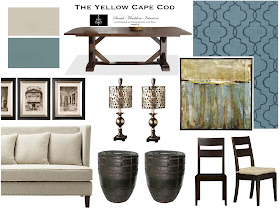
While I'm busy wrapping my home in fall decor, I'll be sharing some recent online design projects we've been working on. Today's featured design was a two room design plan created for Hannah's Dining Room and Living Room. Hannah's home is beautiful. She is so lucky to have a gigantic formal dining room large enough for a dining table and a lounging/seating area.
Some of the products in this design came from places like Potterybarn, Ballard Designs, Crate and Barrel and Home Decorators Collection. In addition to these great finds, we wanted to give Hannah's dining room something really unique. We accomplished this with a pair of drop. dead. gorgeous. buffet lamps. Not only do they provide ambient lighting, but they serve double duty as sculptural art.
(Now available in my shop)
In Hannah's Living Room...
…we gave her an beautiful gray sectional, a pair of sexy blue chairs, character rich occasional tables, a custom paint color palette, fabulous drapes and fun accessories. One of Hannah's favorite elements of her new living room design is the coffee table. We recommended a simple area rug for this space to allow the coffee table be the star of the show.
Designing the dining room and living room at the same time allowed us to create seamless flow between the two spaces. It also scored Hannah a discount on our design services (see our multi-room pricing here). These two spaces are in close proximity so it was important that they compliment each other.
Here are the two true-to-scale floor plan illustrations we prepared for Hannah…
This birds eye view of her dining room (left) and living room (right) shows how the design elements we recommended fit into the space. It also shows Hannah exactly where to place her new furniture, rugs, drapery and accessories. Along with these design boards and floor plan illustrations, Hannah also received a product source list ("where to buy" shopping list), specific paint color suggestions, drapery recommendations, and step-by-step instructions on how to implement the design.
Below you can see how each room has it's own look, but together they create one coehesive design. Both spaces share the same palette of what I call "tempered teal" and gray. I love this muted shade of teal. It's dramatic, but sophisticated. Rich, but not overwhelming. Natural wood tones add warmth to this gorgeous color combination.
More to come on Hannah's home. We had the privilege of designing her master bedroom as well, can't wait to share. Thank you, Hannah. For information on how our online design plan service works or to make your reservation, please visit our design services menu, here.
© Copyright 2013 The Yellow Cape Cod


Loving thte tempered teal and gray! Very nice designs.
ReplyDelete