This post is sponsored by Dutch Boy Paints.
Today, I'm sharing a quick, but dramatic room makeover that I tackled last weekend. With a little creativity, a spare weekend, some #DIY spirit and #DutchBoyPaint, I was able to give my son a new space that is unique, on-trend, organized, and most importantly, one to call his own. My two boys have been sharing a room since they were babies. Since my daughter recently went off to college, we decided to play musical rooms and give the boys each their own space. Here's a couple of pics of their shared room from over the years...
Before
Before
I loved the red, white and blue "stars and stripes" theme, but now that my kids are teenagers, it's time for a change. We started by moving my youngest son out of this space and into my daughters old room. Then, I started a makeover on the room for my oldest son. After many years of two boys living in there, it was in need of a fresh paint job. It was already a really nice shade of navy blue. I gave the stripes a light sanding, filled in the damaged areas of the walls and gave the room a fresh coat of navy blue. To get a similar look, you can use Dutch Boy Ocean Depth (337-7DB).
This gave us a nice, blank canvas to work from. I took this opportunity to give him a chance to have a say in the new color scheme and design. He selected a colors that complemented his favorite college sports team. Using his favorite sweatshirt and hat as inspiration we came up with a gray, black, white and navy palette.
Dutch Boy Paints recently came out with their 2019 #ColorTrends Forecast. It offers three palettes that made it easy to select a gorgeous, on-trend feature color to bring this new space to life. I immediately fell in love with Cooled Graphite from the Studio Palette. Selecting paint colors can sometimes be a little daunting, but the three palettes curated and released with the Dutch Boy Color of The Year can take the guesswork out of choosing a great shade.

I knew Cooled Graphite (436-6DB) was going to be perfect. It's a deep, cool gray that is eye-catching and dramatic. I loved it so much that I decided to use it on the main focal point of the new design...built in bookcases surrounding the bed.
I knew Cooled Graphite (436-6DB) was going to be perfect. It's a deep, cool gray that is eye-catching and dramatic. I loved it so much that I decided to use it on the main focal point of the new design...built in bookcases surrounding the bed.
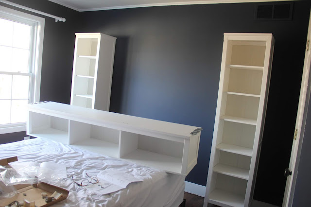
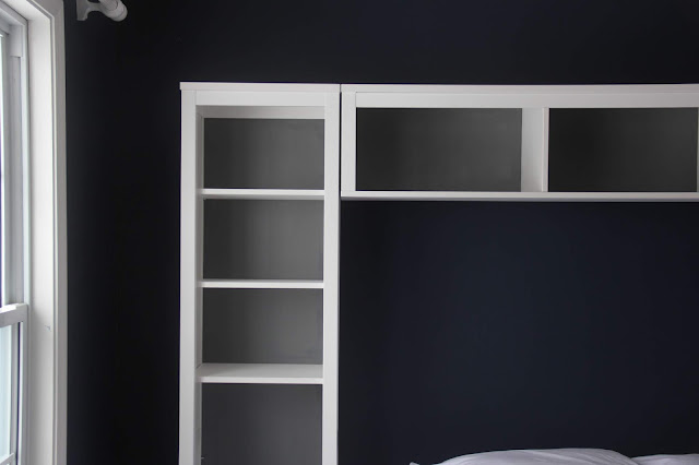
This is where paint became a very important factor in the design. After the bookcases were assembled, I began to customize them to give them a unique, high-end look. By painting the backs of the unit with my feature color, Cooled Graphite (436-6DB), they were quickly transformed.
As part of this collaboration, I was provided the paint and supplies to complete this project. Dutch Boy Paints recommended that I use their Cabinet, Door and Trim paint on my bookcases. I was really impressed with not only the quality of the paint, but the paint "can" itself. It made the whole process simple, quick and mess-free. The container with a built in handle makes it so easy to open, close, pour and store the paint when you are done. No tools needed to pry the top of a can open, just twist off the lid and pour. The spout allows you to pour the paint right into your tray without the need to clean up messy drips down the side of a can.
These features were especially great for someone like me who didn't have a lot of time to complete this makeover. The ease of use and absence of a big mess helped to keep this project on pace.
The Cooled Graphite accent color created a rich and dramatic backdrop that made the bookcases come alive. I immediately loved the way the deep gray looked with the white finish on the outside of the bookcases. The contrast was crisp and fresh.
Once the bookcases were dry, I brought in all of the other design elements and the room quickly came together.
Here it is...
Adding woven storage baskets to a few of the shelves offer attractive storage and brought in a lot of visual texture to the design. I love the way these warm, dark baskets look against the Cooled Graphite paint color.
Lending a nod to theme of the space and the trophy display surrounding the bed, this framed quote art was a perfect focal point in the center of the feature wall.
To take the customization of the bookcases a step further, I added these cool clip lights to each end unit. They offer dramatic accent lighting by illuminating the display.
Using the Cooled Graphite color as my guide, I selected drapery and bedding in the same tone. These elements pulled the new look together.
Tip:
A couple of tips that I would like to share...when painting a space a dark color, you can avoid drawing attention to unattractive air return vents by painting them the same color as the wall. Here is a great example of how doing so makes the vent almost disappear.
Tip:
Another tip I'd like to share, is if you have tall items that you would like to display, leaving a couple of the shelves out of your bookcase unit will provide enough height for items like these tall trophies.
Styling the new bookcase was my favorite part of this makeover. It was fun to see how the gray backdrop provided contrast to his special things, making them stand out.
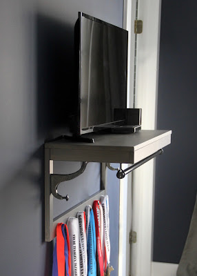
Dutch Boy Paints offer their paint colors in several different types and finishes. You can pretty much customize anything to bring your own twist on a space. For instance, this hat rack makes a really cool shelf for his TV and doubles as display space for medals. The hat rack came from Ikea and is available in several colors, but if you wanted to customize it and tie it in with another piece of furniture in the room, a quick paint job can do the trick.
The bar below the hat rack is perfect for hanging clothes out the night before a big event. Hats and bags can hang from the hooks below as needed and medals look really cool hanging from the knobs along the bottom.
This makeover is a great example of how a little creativity, a little time, some DIY spirit and paint can help you create a unique space easily. By altering this off the shelf bookcase unit with paint I was able to bring personality to it and make it a key feature in the design.
Dutch Boy Paints are available at Menards.
I received product and compensation to in order to facilitate this collaboration with Dutch Boy Paints. However, my opinions are completely honest and all my own.
Thanks for stopping by today and letting me share this makeover with you.
Back to the Design Studio!
We currently have openings for new Online Design Projects (E-Design). If you're interested in getting started on a room makeover in your home, please click here to make your reservation.
For more information on Dutch Boy Paints you can follow them on facebook, Pinterest, Instagram or here at their brand website.
For more information on Dutch Boy Paints you can follow them on facebook, Pinterest, Instagram or here at their brand website.


No comments:
Post a Comment